Reimagining Public Healthcare
Transforming a national healthcare app to reflect the way Singaporeans live, decide, and care.
Role
Lead UX Researcher, Interaction Designer
Industry
MOH & Synapxe (Healthcare)
Platform
Mobile

Challenge
Singapore’s Ministry of Health (MOH) wanted to unify the healthcare experience across the country’s three health clusters.
My UX audit across all three apps revealed each cluster had overlapping functions; appointment booking, medication tracking, health records, caregiver access, payments. But the apps were policy-led and siloed; citizens had to manage fragmented journeys and download multiple apps just to care for themselves or their families.
My Role
I partnered with the Chief Experience Officer to lead all research activities; planning, fieldwork, synthesis, and stakeholder alignment. This included UX audits, user interviews and usability testing with 51 users, and 2 surveys with over 300 participants.
I worked closely with designers to translate behavioural insights into design improvements for the new, unified HealthHub+ experience, through journey maps and wireframes.

Process and Core Tensions
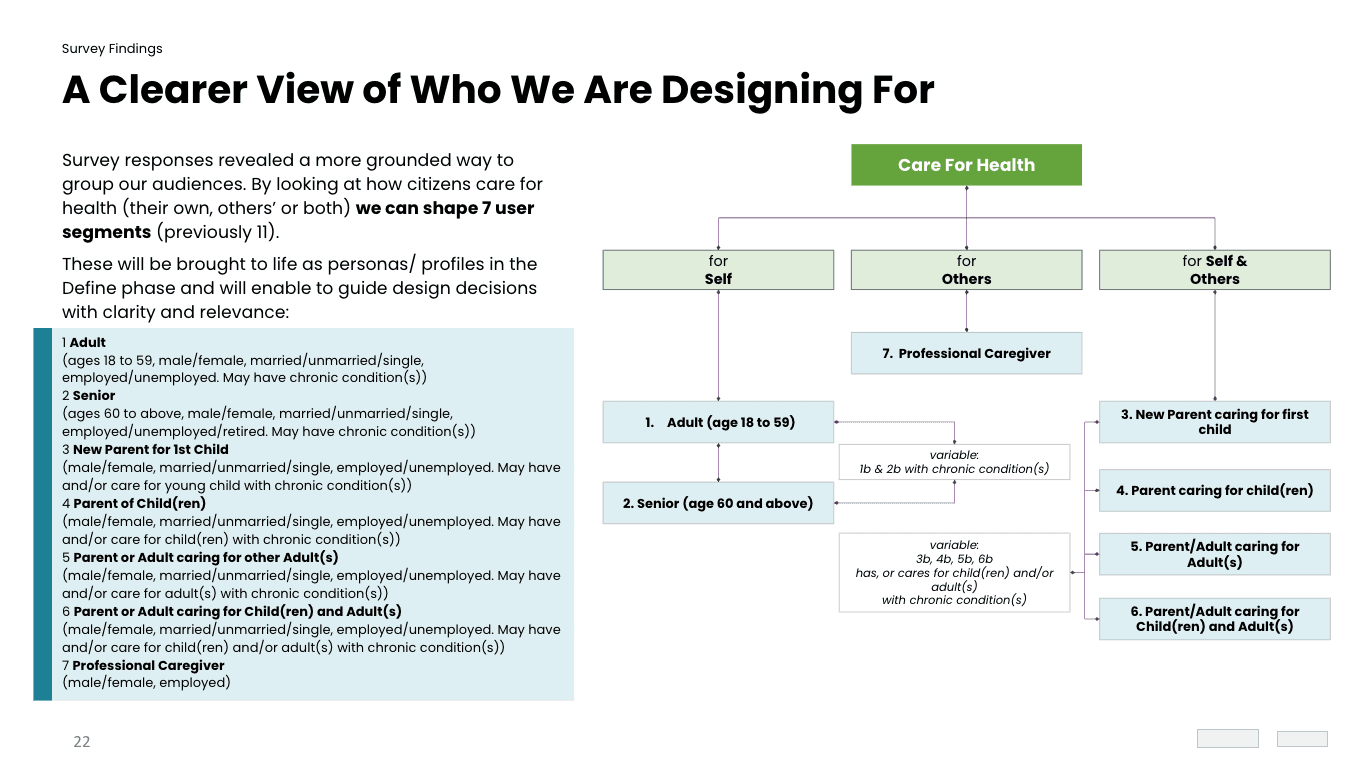
Breakdown of User Segments
What We Discovered
The initial hypothesis was that consolidating three healthcare apps into a single platform centred around five core jobs-to-be-done—managing appointments, medications, payments, health records, and caregiver access—would improve efficiency by reducing the need for citizens to switch between applications.
Through surveys and in-depth interviews, I discovered that health was not purely a functional task. While users valued convenience and streamlined access, their experiences were also shaped by uncertainty, stress, and anxiety associated with seeking care and managing health conditions. This showed how a successful healthcare experience needed to support not only task completion, but also users' emotional needs and confidence in decision-making.
These findings, alongside the following insights, guided the team to reframe HealthHub+ from a collection of healthcare transactions into a more citizen-centred experience:
1. People want care that fits their lives—not just check boxes
Current systems structured care around rigid, compliance-driven processes. But over 80% of users wanted flexibility—tools that adapt to their routines rather than dictate them.
2. Managing health is a team effort, not a solo interaction
Most apps assumed health was managed by one person. But in reality, care is often a shared responsibility across family, friends, or professionals, as mentioned by over 70% of users. This helped me narrow down our core audience to users who frequently use the app for themselves, others, or both; namely those with Chronic Conditions, the Sandwich Generation, and Seniors. I determined that if the edge cases for these personas were covered, it would also meet the needs of other secondary and tertiary audiences provided by the client.
Using these, I created journey maps that detailed how users would go through our 5 core jobs-to-be-done and highlighted the differences between self-care and caregiving experiences. I created an AI agent with context of the project to study the journey maps and identify potential improvements to the flow, and used these iterated journeys to run workshops with key stakeholders across the three clusters to align journeys to policy, tech, and user needs.

Journey Map

Stakeholder Workshop
Designing for Adaptability, Visibility, and Confidence
With feedback from both users and stakeholders, we concluded that designs needed to follow certain principles; to lighten the load for users, guide them to the right care, recognise them across all stages, and understand the context of their situation.
I partnered with designers to wireframe the aligned journeys and used ChatGPT to refine copy into supportive, informative, and neutral messaging. After stakeholder alignment, we developed high-fidelity prototypes and validated them through three testing rounds—starting with our key segment, adults with chronic conditions, followed by the next prioritised segment of the Sandwich Generation, and finally seniors.
This phased approach allowed us to iterate and strengthen core journeys early, close validated flows with confidence, and progressively focus on other jobs-to-be-done in subsequent rounds.
The experience was elevated through the following:
1. We reframed the app from a task checklist to a guide—something users could lean on to manage care confidently on their terms. Step-by-step flows with recovery patterns and contextual guidance were introduced to support informed, independent decision-making.
→ All users said they felt more confident and in control, with less stress around managing care.
2. We redesigned the platform to support multi-role coordination, allowing shared access to information and actions without switching accounts.
→ Over 70% of Caregivers especially valued being able to manage multiple care activities in one place, and finally felt supported by the system.
We developed a fully working demo with the testing findings, and leveraged the AI agent to generate 182 user stories that informed and accelerated design sprints. I used these to lead stakeholder discussions that grounded decision-making in citizen needs, while balancing the realities of policy, technology, and implementation. Through consistent facilitation around the complexity and systemic friction across multiple healthcare clusters and organisations, I built stakeholder trust, aligned competing priorities, and helped shape a scalable foundation for future AI-enabled healthcare services.


“This is definitely much more user friendly than the current one, for sure. I would think this is much better to use.”
Sandwich Generation User
Results and Impact
Delivered a unified, goal-driven app built around real moments of care.
Shifted MOH’s approach from policy-first to citizen-centred service design.
Created modular templates and a shared design system with 408 Figma screens and 196 design tokens (76 foundational, 120 semantic) for roll-out across clusters.
Built a future-ready foundation for AI-enabled, preventive, and personalised healthcare by positioning HealthHub+ as the keystone product of Singapore’s Digital Health Masterplan.
What I Would Do Differently
The Explore page initially focused on preventive health as an individual activity. Drawing on findings from my previous health research that suggested group interactions were helpful in driving intrinsic motivation, I introduced community-based activities to encourage participation through social motivation and support. I also prioritised video content to align with growing preferences for short-form, bite-sized learning, while retaining articles for users who preferred deeper exploration.

Reflections
Policies and functions often shape how systems are built, but real design impact comes from understanding what people actually do.
When we design from the workarounds people already use, and the emotions they carry, we move from designing for users to designing with them. That’s how healthcare becomes not just compliant, but genuinely human.
